SBC Skateboard Magazine | 15.1
New volume of SBC Skateboard, new design, new wordmark, new paper stock.
SBC Skateboard 15.1
(2013 )
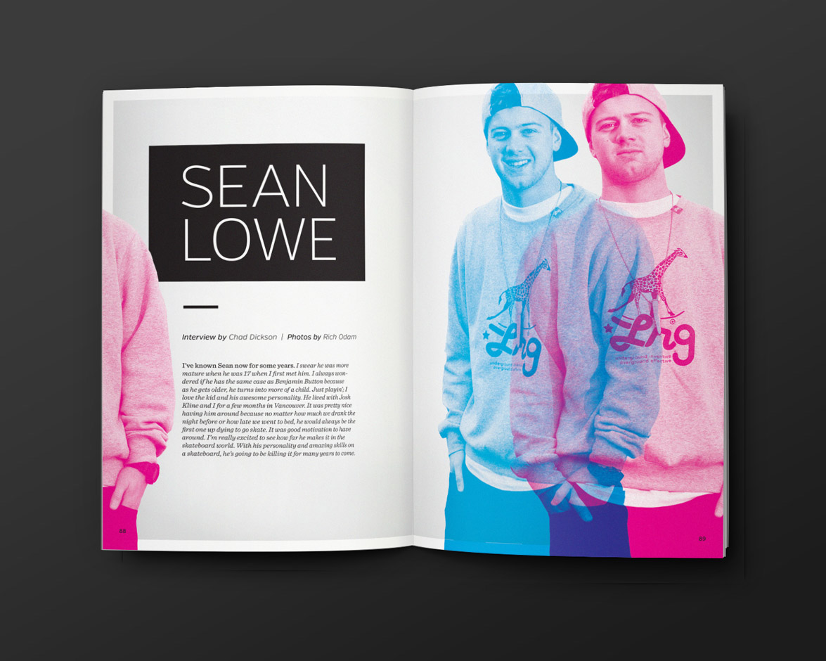
This season we redesigned the magazine to loosen things up and add some breathing-room. With the amount of information our eyes look at on a daily basis, it was time to simplify. The days of big sell-lines and bold colours seem to be history (at least in this industry). We decided it was time to go with a tactile package rather than flash. The matte coating on the cover gives it a rubbery feel, which we have never experienced on the newsstand. The inside stock was thickened up and the final product was well received. The wordmark was refreshed with a rounded version of Halis and, again, some breathing room injected.


